As a bit of research I am going to look into why soap free is good for women especially in intimate parts.
http://www.womensweb.ca/health/repro/intimate.php
This website tells you why cleaning your intimate area is good but doesn't have to excessive as bacteria is good for you in the intimate area.
http://www.femfresh.com.au/FemFresh_Intimate_Wash
Soap products can upset the natural balance of your intimate area which is bad for you and can dry your area up which is not good.
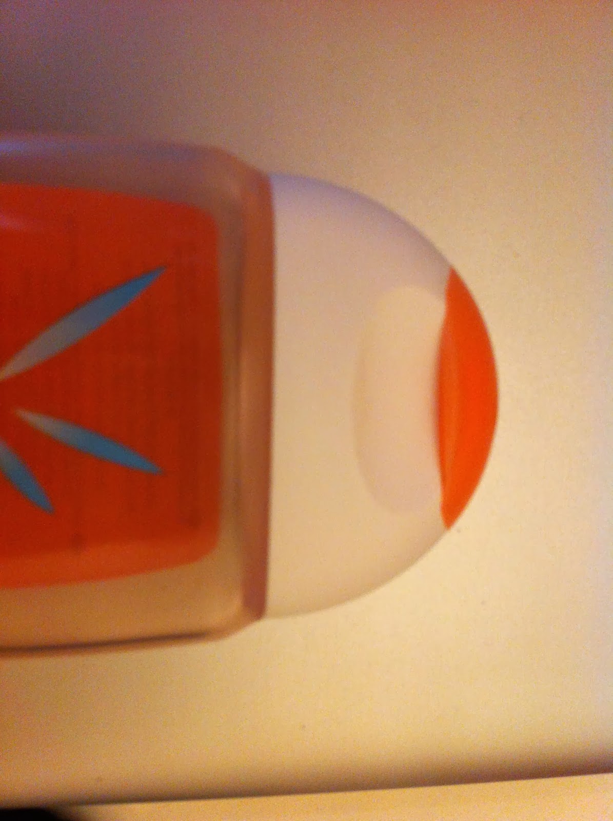
Here I went out and bought the product myself to see what the product looked like, smelt like and just to see what the bottle is like etc for my own personal research. I found the words used on the bottle itself is very confusing and to younger people they might not understand the words used.
I think this could be changed to something simpler along with the colour?
Colour meaning
For Femfresh i think this is a difficult to package as its not something people like to talk about. I think other competitors such as Always/durex which are similar brands. They have managed to get a fun appeal to it, however cleaning your intimate areas are hard as people don't like to be seen buying them. Looking to in the shops in the hygiene section the main thing is colour!
The colours that I feel could work are:
- Blue- Trust/peace/loyalty and integrity as well as conservation/figidty
- Purple- Imagination, it can be creative and individual or immature and impractical
- Silver- Has a femmine energy, related to the moon, ebb and flow of the tides, its fluid, emotional, sensitive and mysterious

Wording
I wanted to concentrate on looking at the wording on the packaging as the femfresh wording is a bit to scientific for the audience to understand.
Words like:
- Discreet
- Scented pantyliners
- Flexi-styles
- Comfort & protection
- Normal
- Simply fits
These words simplise what the product is for and the feel of luxuary. Luxury might be something to look at for the wording etc.


No comments:
Post a Comment