


Here Iv collected some images of water lily's that have water droplets on them as well as with the flower itself.
For some inspiration on adverts I looked at Herbal Essences as they also use flowers along with fruit to show the audience what is in the product. However they make there adverts exciting and use the sex appeal to help advertise the product. Some examples of tv adverts:


With these adverts they use the flowers and coconuts as there main seeing point as they are the scents for the products. The last image here I like as the idea of the rainforest is used, the colours and the wording on the advert works really well. Again sex appeal works to sell products especially this product as the shampoo is suppose to give you an orgasmic experience.


Here you can see a few ideas I had that I wanted to bring to paper. I really wanted to use the idea of the water lily as the main focus of the product. So I wanted to play around with the idea of a leaf and have the bottle big on the advert.


Again I wanted to explore my idea of using the water lily pads as I think this is a good way to link the bottle to the idea. I liked the words "Delicate as a water lily" as i think this is a nice way to link the lily to your intimate area. I tried out different images and different positions on the page to see what would look good and what I could develop on. The last two images here I was heading a different way to not have the bottle not on the advert, which is bad as I am suppose to be advertising it!
I however after taking a longer look at the images I have decided this idea does not work it's very boring and doesn't make the product stand out to the younger generation. This is a way of me going back to the pointless advertising they had before. I would like to try more of a different approach instead of something basic and safe.


Here you can see that I have pulled myself away from the photos of water lily pads which I prefer and I think even though this isn't a right thing for my adverts I think it could take me somewhere new. I do like how the lily is a focus on the bottle and I think this again is something that I can use to my advantage.
The question I need to ask myself is why would people buy this product!? I think people should buy to keep you feeling clean and fresh.
I think people should buy this product as its soap free and keeps you clean in your intimate areas.
I had another thought about my campaign I like the idea of having the lily tattooed on the model as a way to show that the water lily is delicate and tattoos are delicate. I also think like the original femfresh adverts with the shower scenes, I think this is an idea that could be made better. I looked on google for images of women in the shower and a few came up that I thought would be good. I then made them into the advert.


These images here show my visions for the adverts, I like the foot images as this is just a bit of a different view on the advert. You don't have an image of a lady or a picture of a ladies intimate parts this is just a simple shot of a body part that suggests she's just had a shower.
I used the idea of the water lily being a tattoo as its a delicate drawing and some people have tattoos as personal thing on there body in secret places so I think the lily can help represents the product.

Here I was trying to find a font that would fit my campaign for femfresh, I chose London MM as it was a nice delicate font that isn't to overwhelming and bold to look at.


Here i tried out different sizes of the product to see how it would look on the advert.
After some time away from this brief I went back to the campaign and I realised that I wanted to change the layout of this campaign as this is more of a billboard than anything else. With the look of this campaign with the feet etc its a lot better than having the entire women in a shower view as I don't think it looks as good as the simplicity of the feet as it's more private which the product is all about.
I would see this product being advertised in women magazine's such as cosmopolitain, to target the target market.


Here are some ideas that I did quickly to get a basic layout.


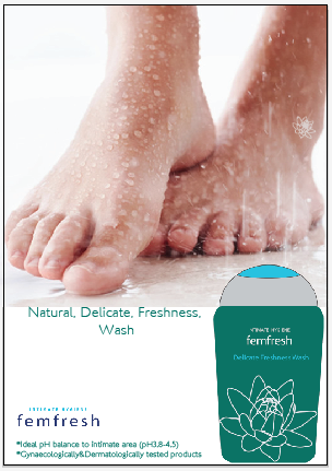


As I have developed this design and made the advert have a few more words i.e. the science part of femfresh. I also added the words natural, delicate, freshness along with natural, delicate, femfresh wash to see which one I thought was better for the advert. I like the the natural, delicate, freshness wash as it gets straight to the point of what the product is and does which is make you fresh.

I like this design as I have added the logo onto the design to finish off the advert all together. I have done this because I think the logo on the bottle is a bit hard to find in away whereas you can see this logo straight away.

I went back to the design as I had a rethink of what I wanted the layout to be with having the logo at the bottom and making the bottle a bit smaller however I think this is overall the better design as it gets the idea of the product across to the viewer.


Here I wanted to create a billboard advert as I felt something else was needed, this is very much the same as the magazine advert however I feel that while people are getting to know the brand the new look the information is needed. I chose the last image here as I felt the scientific part of what the product does was to big and a bit to centred and I wanted to be more focused on the logo and the new bottle. I again think this advert can be used as TV advert because of the simplicity of it and it's a fresh new look that will be noticed by the younger generation.
No comments:
Post a Comment